 Ever wonder why companies use certain colors in their branding and marketing?
I certainly have. I was so curious about the use of color psychology in the business world that I decided to do a little research and find out exactly what using specific colors means for a brand.
Below I’ve summarised and explained the meanings behind some of the main colors used in marketing – how it affects your potential customer – and how use of each color contributes to the purchasing decision.
A quick word of warning: Make sure you know who your target audience is as cultural differences can result in varied interpretations of a specific color. A quick example: Yellow is associated with courage in Japan; however, in western cultures it tends to represent cowardice!
There is no doubt that some companies choose to use specific colors in their marketing because of personal preferences. How about you? Have you considered all the implications of color psychology in your branding? Color choice plays a big part in how your customers perceive your product or service, make sure you’re not making a big mistake with your color choices by reviewing the explanations below.
Note: The descriptions and definitions below generally refer to color psychology in western cultures, in particular in the US.
Red: Stimulating the senses
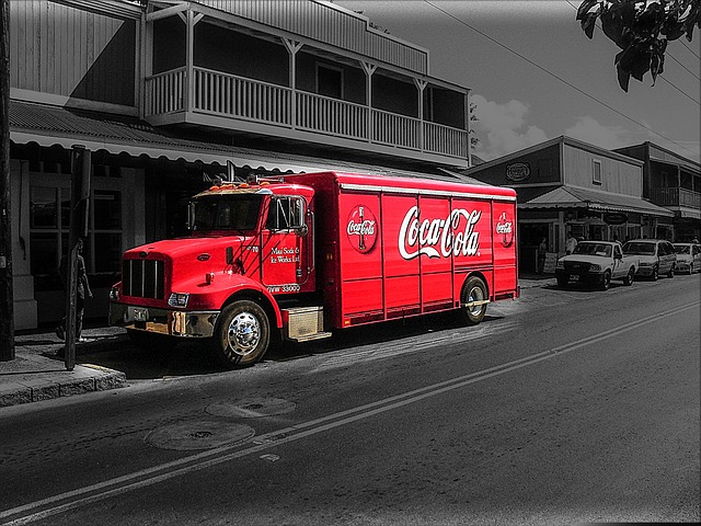
Action, energy, power, strength and courage are all words associated with the color red in psychology. There is plenty of evidence to suggest that use of red stimulates the senses, as a result, it can increase heart rate, blood circulation, and even blood pressure.
Because of this stimulation, you’ll often see the color red being used in clearance sales as it encourages buyers to take action and purchase. A perfect example would be signs in stores designed to increase impulse buys and Calls to Action on websites.
Perhaps the best example of the use of red is to stimulate appetite. Why do you think fast food restaurants like Mc Donalds, KFC, Wendy’s or Pizza Hut use so much red in their branding and within their restaurants? Because it helps them sell more!
We couldn’t end a description of the color red without mentioning its use to evoke passion, intensity and love.
Blue: Creating a sense of trust and calmness
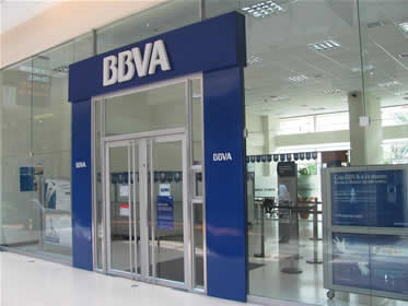
Apparently blue is the color most preferred by men (certainly true in my case :-)). It creates a sense of trust, dependability, calmness, and serenity hence the reason it is a favorite in the banking, financial services and insurance industries.
People are more productive in rooms and offices which use the color blue so it is often used in corporate settings. If you don’t like taking risks and prefer playing it safe, blue is probably the color you want to use. Don’t use blue to decorate a restaurant; it actually reduces appetite!
Blue comes in many shades and tones. Lighter shades are often used in travel and leisure industries – think travel agencies, spas, health and wellness.
Yellow: A popular color for children’s products
Yellow is a warm, cheerful and uplifting color. It stimulates the mind and creativity and as a result is often used in children’s products. Use it sparingly as too much can cause anxiety and nervousness.
The power and strength of the color yellow has led to its use by many companies, especially in conjunction with other colors – Mc Donalds anyone?
Green: Health and Wealth!
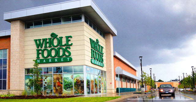
The color green is associated with health, tranquility, money (especially darket greens), wealth, nature and growth.
Companies specializing in nature, the environment, health and healing are avid users of the color green. Many of the natural and organic products found on the shelves of stores will use greens in their packaging.
Orange: The color of energy

Orange is an energetic color which is ideal for risk takers and extroverts. As a result, you’ll see it being used in travel sites and activities which involve adventure and fun.
Also creating a sense of warmth, caution, enthusiasm and excitement it’s a color that is often used to draw attention to specific signage in shops and stores.
It’s similarity to the color red means that it also stimulates appetite and conversation and is therefore used in restaurants and fast food outlets.
A word of warning: Go easy on the orange as too much can give the impression of cheapness!
Pink: For targeting the female market
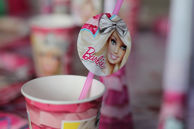
This calming, clean and romantic color is used by many business targeting the female market. It’s use helps to target your audience very quickly and in darker shades creates a sense of passion and energy.
Fashion, cosmetics and beauty are all industries in which the use of the color pink is widespread.
Purple: Royalty and Wealth
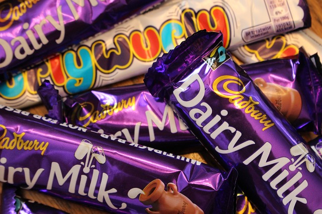
Purple is associated with royalty, wealth, success and wisdom. You’ll often see it being used in academic institutions and in products of high quality.
Also used to soothe and calm, it’s more ideally suited to products and services targeted at women and children.
Gold: The color of victory!
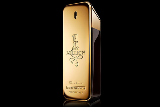
Gold is used in expensive and exclusive products due to its association with quality, wealth, prestige and luxury. It’s also the color of victory due to its use in the winning medals in sports events.
As you’ll see later on, combining gold with black is a popular choice when you wish to sell products to men.
Although it is an effective color to use in packaging, its use doesn’t translate so well to the web where it can become rather dull and yellowish.
Silver: Sleek and modern
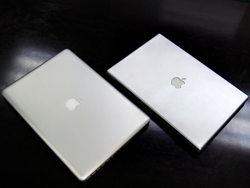
photo credit: wZa HK via photopin cc
Silver is another color associated with prestige and wealth. It’s sleek, elegant and modern appearance make it ideal for the high-tech and computer related markets; Apple’s products are a great example.
Once again, care should be taken when using silver on websites as it can appear more greyish in colour and hence have the opposite effect on your site visitors.
Black: Power and sophistication
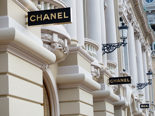
This powerful and sleek color is used primarily to market luxury products; used with gold and silver it gives products a more sophisticated look.
Wouldn’t you agree that packages that use black make the item appear more expensive? It definitely creates a higher perceived value.
Careful with using too much black; it’s always best to combine it with another color (Gold, Silver) to avoid coming across as being too serious and depressing!
White: Ideal for health related businesses
The color white evokes cleanliness and purity. That’s probably why it’s used by businesses in the health industry: Hospitals, doctors surgeries, dentists, etc.
Although not particularly stimulating to the senses, white is a color which is calming and gives an air of simplicity. This simplicity makes it a great choice as a background color on websites, making all the other colors stand out.
Brown: A down to earth color
This is probably the most homely,earthy and comforting color. Its natural and organic nature makes it suitable for businesses related to outdoor activities and products as well as natural and organic products.
Whereas pink is more commonly associated to women, brown is a more masculine color. It’s a more practical and durable color (hides dirt!) although it can also be a little boring!
How Colors Affect the Purchase Decision
An interesting infographic by Neil Patel, (click here to see full infographic) brought to light some interesting statistics relating to color and how it affects the purchasing decision.
- 93% of shoppers place visual appearance as a primary factor when shopping
- 85% of shoppers place color as a primary reason for why they buy a particular product.
- Color is also important in branding; it increases brand recognition by 80%!
Consider how you use the above colors in your business. Think about how you can use color psychology in your logos, business cards, website, brochures, product packaging, office décor, staff uniforms, everything your potential client comes into contact with. A few tweaks to your use of color could have a big impact on your business.
What image are you trying to transmit as a company? How can color psychology influence this? Let us know in the comments below.